Dashboard
Table of contents
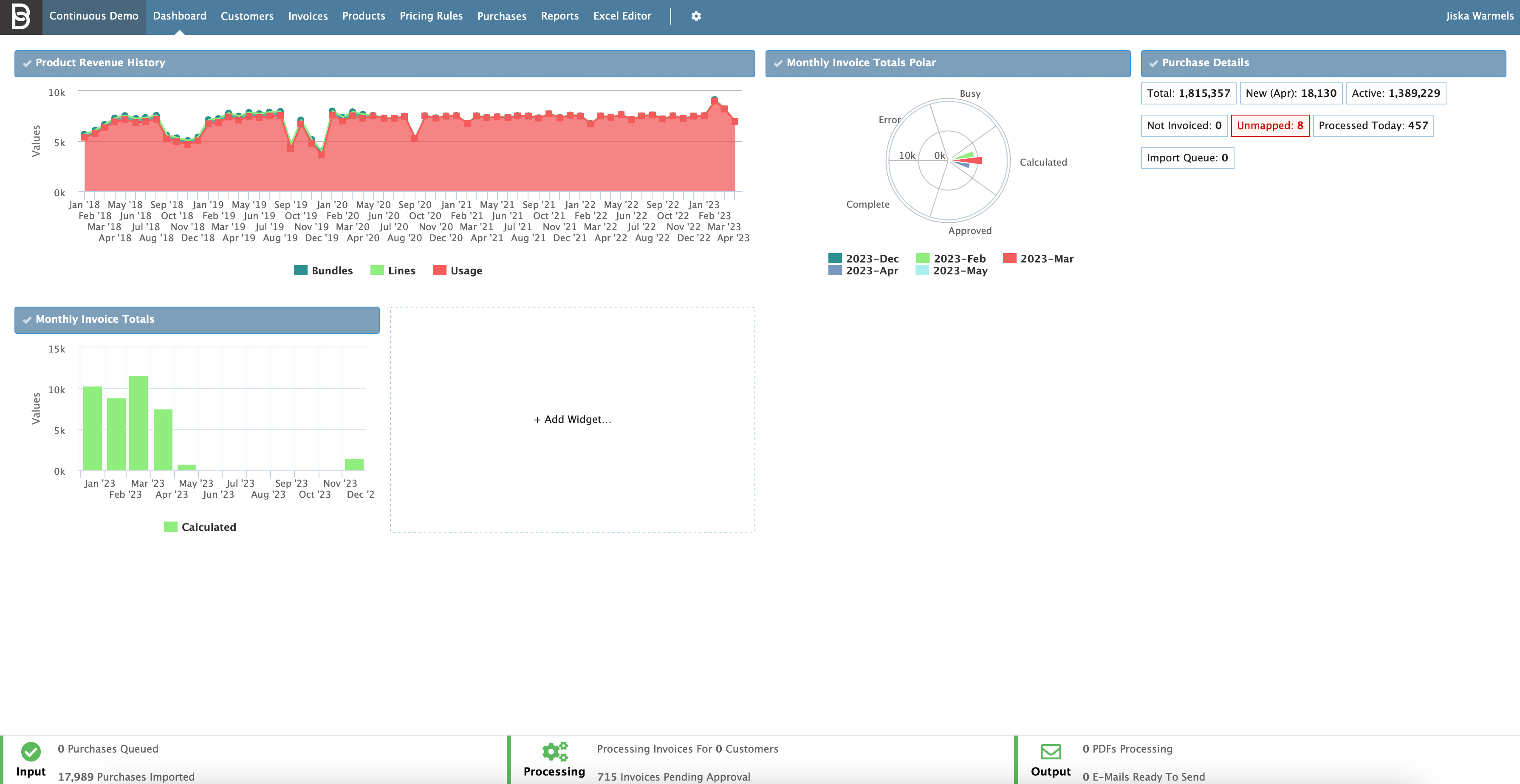
When a user logs into CloudBilling, the first page they will be greeted by is the Dashboard screen, as can be seen in Figure Dashboard 1. This screen is also called the CloudBilling Management portal, as the Dashboard provides access to an overview of the most up-to-date information in CloudBilling. There are multiple different “Widgets” that can be selected on this page, but usually there is a standard set already configured for each environment. Each widget can be adjusted to suit the needs of the user and their organization.
Figure Dashboard 1: Dashboard screen
Currently, there are System Detail Widgets available for the dashboard. This means that the set of currently available widgets give an insight in the data that goes through CloudBilling specifically. The different possibilities for adding widgets will be explained in further detail in Widget Configuration. Additionally, the progress bar at the bottom of the screen will be explained in Process Status Bar. This progress bar is present on all CloudBilling pages and can be used to see the activity in the CloudBilling environment.
Widget Configuration
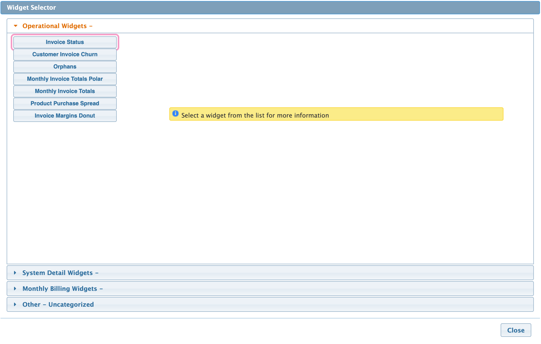
The Widget Selector can be accessed by clicking on the Add Widget box, as shown in the Dashboard in Figure Dashboard 2. This will open a pop-up window which shows the different Widgets can currently be selected. There are four categories for widgets:
- Operational Widgets: provide insights into the billing information of the user.
- System Detail Widgets: provide insights into the platform details of CloudBilling.
- Monthly Billing Widgets: provide insights in revenue, cost, and margins.
- Other Widgets: any uncategorized widgets, currently empty.
Figure Dashboard 2: Widget Selector pop-up screen
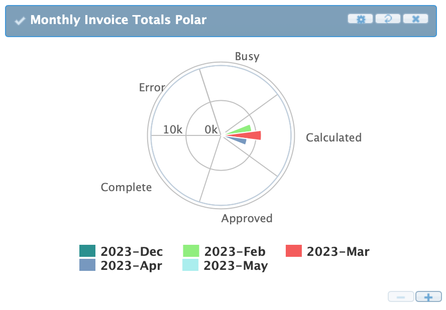
In the Widget selector, new widgets can be added and the Title of the widget can be changed. Other settings of widgets can be adjusted when hovering over a widget (Figure Dashboard 3). The plus [+] and minus [-] buttons at the bottom can be used to resize the widget. The three buttons at the top can be used to change the settings, refresh the widget, and remove the widget. Clicking on the [Settings] button on any widget (indicated by a small gear icon) will expand the configuration box specific to each widget. The user can then change any relevant settings that may apply to the current widget. The second button will refresh the widget without having to refresh the entire page. The last button, marked with an x, will remove the widget from the dashboard. Widgets can always be re-added in the widget selector.
Figure Dashboard 3: Widget with buttons
Widgets can be moved around the dashboard, to whichever order suits best. To do so, drag the widget (by clicking and holding on the title bar of the widget to be moved) and drag the widget to the desired slot. The screen will highlight the area where the widget will drop in yellow. Releasing the mouse button will drop the widget in that place, and the dashboard will rearrange all other widgets accordingly.
Specifically, the System Detail Widgets are recommended to use on the Dashboard. The Purchase Details widget will, by default, be installed for a new customer environment. The System Widgets in CloudBilling display basic information about the current CloudBilling environment, and the data held within. By using these widgets, the user can gain immediate and relevant insight into the various metrics of the system. For example, the number of customers currently being serviced, the number of Unmapped Purchases recently imported, or the number of problematic invoices in the environment.
The Widgets contain information on the elements that exist in CloudBilling. Especially the Unmapped functionality is important. When a purchase, customer, or invoice is unmapped, it means that CloudBilling could not automatically connect something that came into CloudBilling to an existing element in the system. This, therefore, needs to be investigated to determine whether it was a user error or an error by the system. These unmapped items should then be mapped. Not invoiced items could also be problematic as there are items coming into CloudBilling that are not on any invoice. The “Not Invoiced” and “Unmapped” items in these widgets are clickable and redirect the user to a page which allows them to further investigate these issues.
Process Status Bar
The Process Status bar refers to the bar at the bottom of CloudBilling that is visible on all pages within CloudBilling (Figure Dashboard 4). This bar shows information regarding the status of the environment and what the system is currently processing. There are three parts to the progress bar:
- Input: Shows the number of purchases that are currently being imported and the total number of purchases that have been imported.
- Before purchases appear in the management portal, they are uploaded to CloudBilling. Purchases enter a queue from
- Processing: Shows the number of invoices that are currently being processed and the number of invoices that are ready to be approved.
- Invoices that are in processing have a status PENDING or PROCESSING.
- Invoices that are ready for approval have an invoice end date that has passed, but have not been finalized (status CLOSED or APPROVED) yet.
- Output: Shows the number of transformation results that are being processed and the number of emails that are ready to be sent in active message runs.
Figure Dashboard 4: Progress bar


